↓
 

Art Naturally

Contemplating Meaning: The Musings of an Artist

  • HOME
  • ABOUT
    • Artist’s Statement
    • Biography
    • Artist Resume/CV
  • NEWS
  • ORIGINAL ARTWORK
    • Recent Work
    • Original Oil Paintings
    • Works on Paper-Color
    • Works on Paper-Drawings
  • PRINTS
    • Most Popular Prints
    • Flower Portraits
    • Landscapes
    • Designer Prints
    • Metal Prints
    • Still Lifes & Interiors
  • BLOGS & NEWS
    • Art Blog
    • Garden Blog
    • News
  • STUDIO GLIMPSES
    • In The Studio
    • Art Work In Progress
  • CONTACT
Home→Tags Color

Tag Archives: Color

Painting Process – Painting the Edges

Art Naturally Posted on January 25, 2021 by Mary AhernMay 13, 2023  

Today I painted for four hours on a painting that everyone thought was finished but I hadn’t yet signed. Everyone loved it but me. I really liked the composition, a rounded peony in a square frame. What’s not to love?

But the edges weren’t working for me. Not the edges of the outside of the canvas, the edges where paint meets paint. Where does one color transition to another? Is the edge hard or soft? Does it blend? Does it pick up color from the adjacent color? Does it offer a stark contrast in tone to the color next to it?

Is that color warm or cool that it’s bumping up against? Warm colors advance, cool colors recede. Is one petal in front of the other? Where is the light coming from? Is there a shadow? If the petal of the flower is warm, the shadow would be cool.

Subtle Exhuberance - Tree Peony: Detail

Subtle Exhuberance – Tree Peony: Detail. Oil Painting on Canvas. To see the finished painting click here!

Continue reading →

Share
Posted in Art Technique, Being an Artist, Musings | Tagged Art, Art Technique, Being an Artist, Color, Creativity, Musings, Oil Painting, Traditional Painting | Leave a reply

Studio Glimpses Video-The Process of Creating the Painting: “Here I Am – Candy Wind Hibiscus”

Art Naturally Posted on July 22, 2020 by Mary AhernOctober 7, 2020  

In my continuing series of Studio Glimpses, I love to respond to questions by my collectors. The process of how I created this painting is generally one of those most frequently asked.

You Tube Video link: (https://youtu.be/pgVtTmQX944)

In this video, I begin by showing you the photo of a flowering hibiscus from my own garden which was the inspiration for this artwork.
Here I write my thought process behind the stages visualized in the video. 

In my initial stage I work out the composition of the final art work and deciding whether it will be a square or a rectangle.

To work out the details of lights and darks that will be in the final painting I like to start with a tonal drawing. Using an HB weight graphite pencil I use my customary swirling strokes to give form to the drawing. Not being partial to outlines I don’t emphasize them but soften the edges by merging them slightly with strokes. 

In order to transfer the drawing to the canvas I used a mapped grid system. In this case, I put a transparent sheet of paper over the tonal drawing on which I’ve drawn a grid. After measuring the same grid on the canvas I was able to upsize the drawing onto the canvas. Using pastels I created an underdrawing of a neutral ochre color using the tonal drawing as my model, followed by a layer of neutral ochre oil paint which seals the surface of the gessoed canvas.

In the next stage, I applied thin coats of oil paints in layers recreating the original composition in the base colors allowing the underpainting to peak through. Many, many layers of thin glazes are applied to give dimension and form to the final painting.

Details are added during the later stages, I think of it as putting jewelry on after you get dressed to go to a party. You save the best for last.

Each day after if finish working on a painting in my studio I photograph it for reference and view the images on my computer to see the progress and decide if I want to make any changes along the way.

I prefer to work on thick gallery wrapped canvas and finish the work off with neutral floating frames. I aim for simplicity in form with exuberance and abundance in surface color. This painting has no visible brushstrokes which is also my preferred style of painting.

Mary Ahern-Original Fine Art and Prints

“Here I Am – Candy Wind Hibiscus” 20×20″ GW oil painting on canvas. $1,950.00.
Check here to see if this painting is still available for purchase

I’m glad you came here so I can share my art with you.

Each person brings their own history, interpretation and emotion to a work of art.

My art isn’t complete without you. Thank you for being here. I love being an Artist!

__________________________________________________________________________

Share
Posted in Art Technique, Being an Artist, Garden Artist, Video | Tagged Art, Art Technique, Being an Artist, Color, Creativity, Drawing, Flowers, Garden Artist, Oil Painting, Pencil, Traditional Art, Traditional Painting, Video | Leave a reply

Enjoy Metal Weather Resistant Aluminum Art Outdoors Year Round

Art Naturally Posted on March 21, 2019 by Mary AhernApril 9, 2020  

Tired of the browns and grays and whites of winter? So am I!

I’m looking to get a jump on some brilliant color outside. I want to see color outside my windows, outside in my garden and outside on my deck. I’ll bet you are too.

Bright splashes of color greet me when the trees are bare and the shrubs covered with white snow. It is so cheery to see in the dead of winter. Seeing color reduces my stress. It probably does for you too. That’s why gardens are so relaxing.

ChromaLuxe exterior grade aluminum metal prints hanging in the garden all winter in the snow. Mary Ahern Artist

ChromaLuxe exterior aluminum prints hang outside in my garden all year long popping color when I most need it.

During the spring and summer, I coordinate the color of my plantings with the colors in my art. It gives me a very creative palette of colors to work with. It adds to the fun of gardening.

I hang my aluminum art on the garage so I can see flowers all year from the windows in my home, I hang the art on my deck where we entertain and select art that color coordinates with my outdoor furniture. As a garden designer, I’ve designed woodland walks around my home and studio and even hang art on the trees for when people wander around on my garden tours.

I tried a lot of products outdoors in my own garden on Long Island in New York where we get snow and ice in the winter and lots of heat in the summer. I found that not all aluminum is created equal since much of it warped in the extreme temperatures. Then I tried the ChromaLuxe brand of exterior grade aluminum. I’ve tested these prints throughout all the seasons and they have flourished in my garden for years.

In my video, you can see some of the ways I’ve displayed my art in the garden and also the gardens of some of my happy customers. Take a look and be inspired.

Click here for the video.

Then have some fun. On my website I’ve introduced a separate category for the indoor/outdoor metal aluminum art with an augmented reality feature. Now you walk around your space with your mobile device and see how my art will look in your own setting. You can also try different sizes to see what will fit perfectly for you.

Seeing this live takes the stress out of deciding what artworks for you. It is the ultimate in customizing your own living spaces both indoor or out. Try it now. No commitment to purchase is needed to see for yourself. Go to my online shop, click on the metal print category, select an image that intrigues you, change the size, try a different print, try a different space. Enjoy yourself now!

Go to the Metal Print Shop section in my Art Shop and try the Augmented Reality for yourself in your own home or garden!


Share
Posted in Garden Artist, My Garden, Video | Tagged Art, Business of Art, Color, Creativity, Flowers, Garden Artist, Garden Design, Gardening, My Garden, Selling Art, Video | Leave a reply

Studio Glimpses – The Making of the Pink Peony Painting

Art Naturally Posted on September 28, 2018 by Mary AhernSeptember 28, 2018  

All of my paintings start with the garden, mine or other gardens. On a trip one spring day in May as I wandered around the peony displays at the New York Botanical Garden, with my phone I took snapshots of many of the unbelievable peonies in their collection in full bloom.

Later that year on a cold winter day in December, sifting through my stash of photos, a particular pink peony image jumped out at me and demanded my attention. I knew we could develop a relationship together. It often takes months to complete a painting so I really have to love my subjects in order to spend that much time with them. We need to love each other.

Once deciding on the size of the canvas I want to use I sketch, using vine charcoal, to give the general outline of the final layout onto canvas prepped with multiple layers of gesso. Then I block in the areas of color, working on my lights and darks. Then I paint using many layers of thin glazing in order to get the vibrancy of color I crave.

Oil paints need a few days of drying times between layers and some of my paintings have 15 to 30 layers of glazing. In order to continue painting every day, I usually work on multiple paintings at a time. Each one a different day. A different palette of colors. A different stage of completion. I like the continuous challenge of picking up where I left off. I keep extensive notes at the end of each day for each painting. A sort of diary of each work.

I paint quite slowly and quite neatly. I don’t like to feel sticky so I’m cleaning brushes and washing my hands constantly. Gloves don’t work for me since I don’t like the barrier they put between my brush and my hand. Rolls of paper towels help with the tidiness of my style of workflow. In fact & have two different brands for two different uses.

I listen to music while I paint. During the duration of this particular painting, I was listening to many CDs of van Morrison music. I don’t know why. I just was. Sometimes I’m in a classic rock groove for weeks on end and other times might be jazz, classical or even new wave relaxation. I don’t plan it. It just happens.

I usually paint with just brushes, fan brushes in fact, but the center of this painting demanded a palette knife. It’s not something I usually turn to but since the painting had a mind of its own I complied. Glad I did since the center of this painting is rich with texture while the petals are completely without texture but rich in nuance.

I named this painting Centering – Pink Peony. The reason is that it represents two different views for me. I can see with my eyes that it’s an interpretation of a pink peony but in my soul I found it centered me. Made me contemplate the meaning of this painting, this flower, this world it had lived in and now lives in again but in a different way. One ephemeral, one eternal.


Share
Posted in Art Technique, Being an Artist, Musings, Video | Tagged Art, Art Technique, Being an Artist, Color, Creativity, Design, Flowers, Garden Artist, Musings, Oil Painting, Traditional Art | Leave a reply

Selecting Lighting for my Painting Studio

Art Naturally Posted on January 15, 2018 by Mary AhernAugust 4, 2018 2

Choosing bulb replacements for perfect lighting in my studio.

Since I have fluorescent fixtures already installed in my painting studio and didn’t want to replace them it narrowed down the search for the type of bulbs i would be looking for. Learning about LED or halogen lighting options, which I might consider if I was designing an entirely new studio, was off my research list. The installed fixtures are 4’ and had a mixture of cool and warm T8 bulbs bought at the local big box store.

Florescent lighting fixture in the studio of Mary Ahern the Artist.

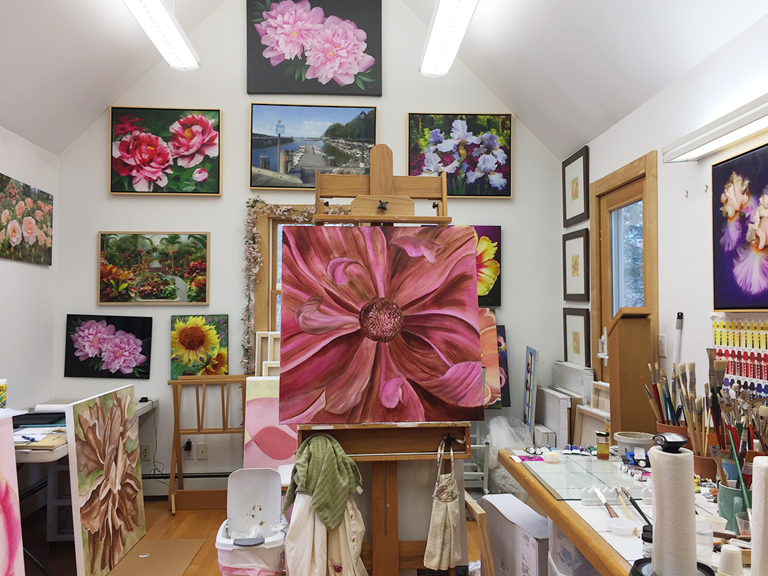
The existing lighting fixtures in my painting studio hold a series of florescent 48″ T8 bulbs.

As soon as I began researching online for the best bulbs for studio lighting I knew the options were very broad and would need more studying. I would need to know what the important specifications would be in selecting the right ambient lighting for working on my paintings and also for proofing digital prints?

In my online searching I stumbled upon a wonderful article by Will Kemp, an Artist & educator from England. He gave some historic references & then went on to explain the technical aspects of lighting.

I learned about the ratings of Kelvin, CRI and Lumens:

K or Kelvin. The color temperature index of cool light at 5500K and a bit warmer light at 4100K seemed to be my goal. I didn’t want to go too cool while creating the Art since most of my work is hung in either residential or corporate lighting environments. Residential incandescent bulbs are in the 2,500K to 3000K range

CRI or color rendering index. I sounded professional when I went to my specialty lighting store and pronounced it correctly, Cree rather than C.R.I. CRI is a measurement of how the lighting reveals colors across the full spectrum when measured against natural daylight. The highest measure is 100 and a good CRI for a painting studio is 85 and up.

Lumens are the measurement of how much light is coming from a bulb. The more lumens the the brighter the light. This differs from wattage which is a measurement of how much energy is used to create the light.

Over the years, as bulbs have burned out in my painting studio fixtures I went to the big box store & bought a warm and a cool fluorescent for each fixture fully well knowing that a more appropriate solution should be available. Recognizing that over the years my lighting had become inconsistent, I decided to bite the bullet & finally do it right.

I was spurred on to optimize my own painting studio by the announcement that the Metropolitan Museum of Art in New York, which I visit regularly to study their paintings, is completely renovating their gallery lighting over the next few years. You can follow the Met’s lighting project here.

I studied the elements of lighting & then went the specialty lighting store that most of the contractors in my area frequent. Initially the gentleman at the counter said that all I needed was an ordinary fluorescent bulb  which I could buy at any box store. Once I began to speak about the technical aspects of the bulbs I was considering, he became interested & spoke with me at length about the options for my studio. We discussed the temperature of the current lighting and the problems I would have if I went to a higher K or color temperature.

So what did I choose?

I chose a bulb with a Kelvin of 4100K rather than 5500K which is often called a daylight bulb. As mentioned earlier, I was considering the rooms in which my paintings are usually displayed after they are purchased. I should also mention that I have a large 10’ north facing window in my painting studio which offers a good deal of natural light.

I also selected a higher than usual CRI number of 85 to give me a more robust range of colors which displays the full complexity of my subtle pigments. Lower CRI’s don’t always show the full spectrum of yellows.

For the lumens my choice was to select 3250 which was brighter than many of the bulbs they were replacing although the wattage remained the same at 32W.

One consideration that I was nervous about was the thickness of the actual bulb. The existing T8 bulbs were thicker than the ones I took home from the lighting store. My consultant assured me that they would be fine in my fixtures and he was right. Less glass didn’t mean less light.

The price for each bulb was a modest $2.40. Well worth the investement!

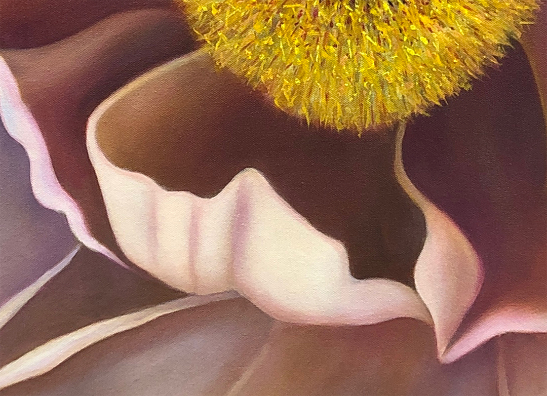
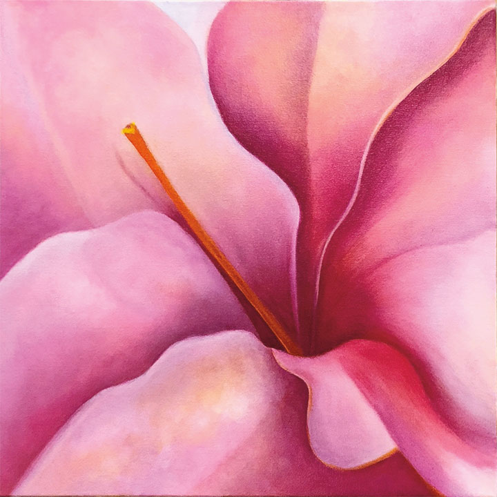
The lighting is perfect! Great color balance, brightness, range. It was worth the time I took to do the research. As an Artist, I research my subjects, paints, pigments, mediums, brushes, canvas, etc., etc., etc… So now I can add studio lighting to the list of professional choices I’ve made towards producing excellent Art.

This is the choice of replacement T8 florescent lighting bulbs for the correct balanced lighting in my studio. I didn’t pick by brand name but by specifications.


Share
Tagged Art Education, Being an Artist, Color, Musings, Oil Painting | 2 Replies

Two Dimensional Design Project – Color

Art Naturally Posted on January 2, 2008 by Mary AhernApril 1, 2009  

During my freshman year in the York College, Fine Arts Program in 1975 I took a class in Two Dimensional Design. First we studied the rudiments of rhythm, and then we abstracted the underlying design elements of images. The third project was an introduction to color. We used acrylic paint to make color charts of both warm and cool gray scales.

2-D Design project exploring color

It took a great deal of trial and error to get even steps from white to black and back down the scale again. As a former musician, I used to play my trumpet scales by the hour, much to the chagrin of my family. Trying to get the color scales right in paint is much the same experience, only quieter.

Another part of this Design project had to do with creating these scales in Color. These color scales were placed against various colored backgrounds to demonstrate how different the same colors appeared when imposed on competing ambient hues. These simple exercises introduced me into the world of luminance, saturation and hue, the basic platform of all painters and colorists.

2-D Design Class exploring gray scale

Share
Posted in Art Education, Art Technique, Being an Artist | Tagged Art, Art Education, Art Technique, Being an Artist, Color, Design, Traditional Art | Leave a reply

Art & Garden Connoisseur’s Newsletter Sign-Up


Have you missed some of my Events, Lectures and Shows?

Why not sign up for my newsletter and be the first on your block to get the latest and greatest News about my upcoming new work, Art Shows and lectures.

Plus you will receive a free downloadable Art Book with my latest work, motivations & influences for you to keep!


Like you, I respect my privacy, so I don't share any of your info anywhere, anytime! I Promise!
Don't forget to Visit My Online Art Shop!

Looking for something perk up your spirits, a gift perhaps or a change in your indoor or outdoor decor. Visit my online shop where you can use my augmented reality/live preview feature to view my art in your own personal setting. Try it, it's fun!

Categories

  • Art Education
  • Art Shows
  • Art Technique
  • Artists
  • Being an Artist
  • Botanical Art
  • Business of Art
  • Garden Artist
  • Musings
  • My Garden
  • Video

Archives

Tag Cloud

Acrylic painting Art Art Education Art History Artists Art Shows Art Technique Being an Artist Blogging Botanical Art Bricks & Mortar Galleries Bulbs Business of Art Career Changing Color Creativity Design Digital Art Drawing Dream Chasing Exhibitions Flowers Gallery Shows Garden Artist Garden Design Gardening Illustration Influences Inspiration Life Drawing Musings My Garden Oil Painting Pen & Ink Pencil Photoshop Poetry Press Public Speaking Selling Art Time management Traditional Art Traditional Painting Video Watercolor

Subscribe to my Art Blog via Email

Enter your email address to subscribe to this blog and receive notifications of new posts by email.

Join 1,436 other subscribers
©2025 - Art Naturally - Weaver Xtreme Theme
↑
 

Loading Comments...